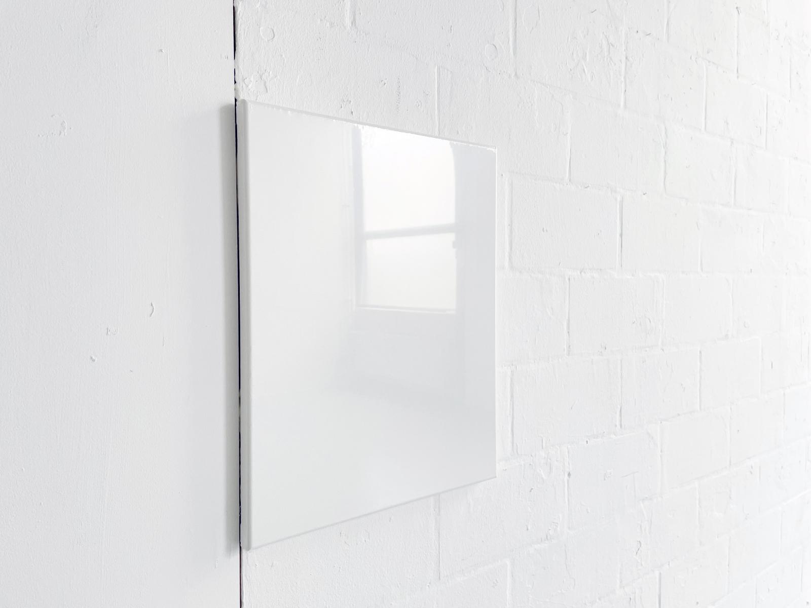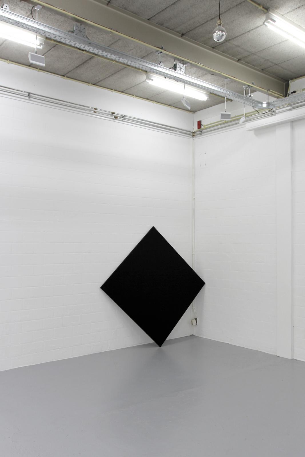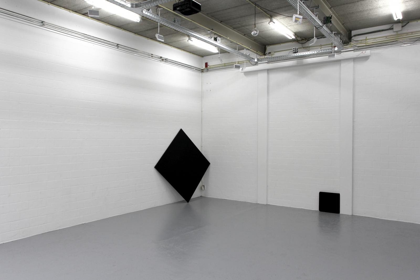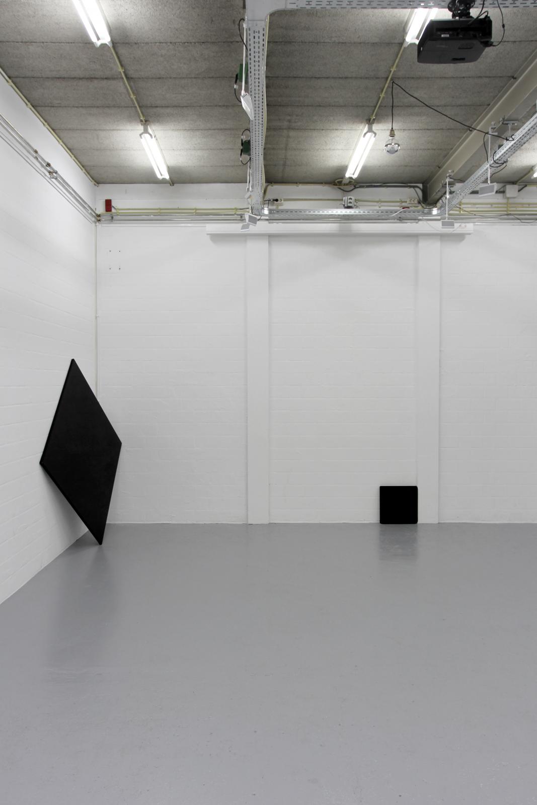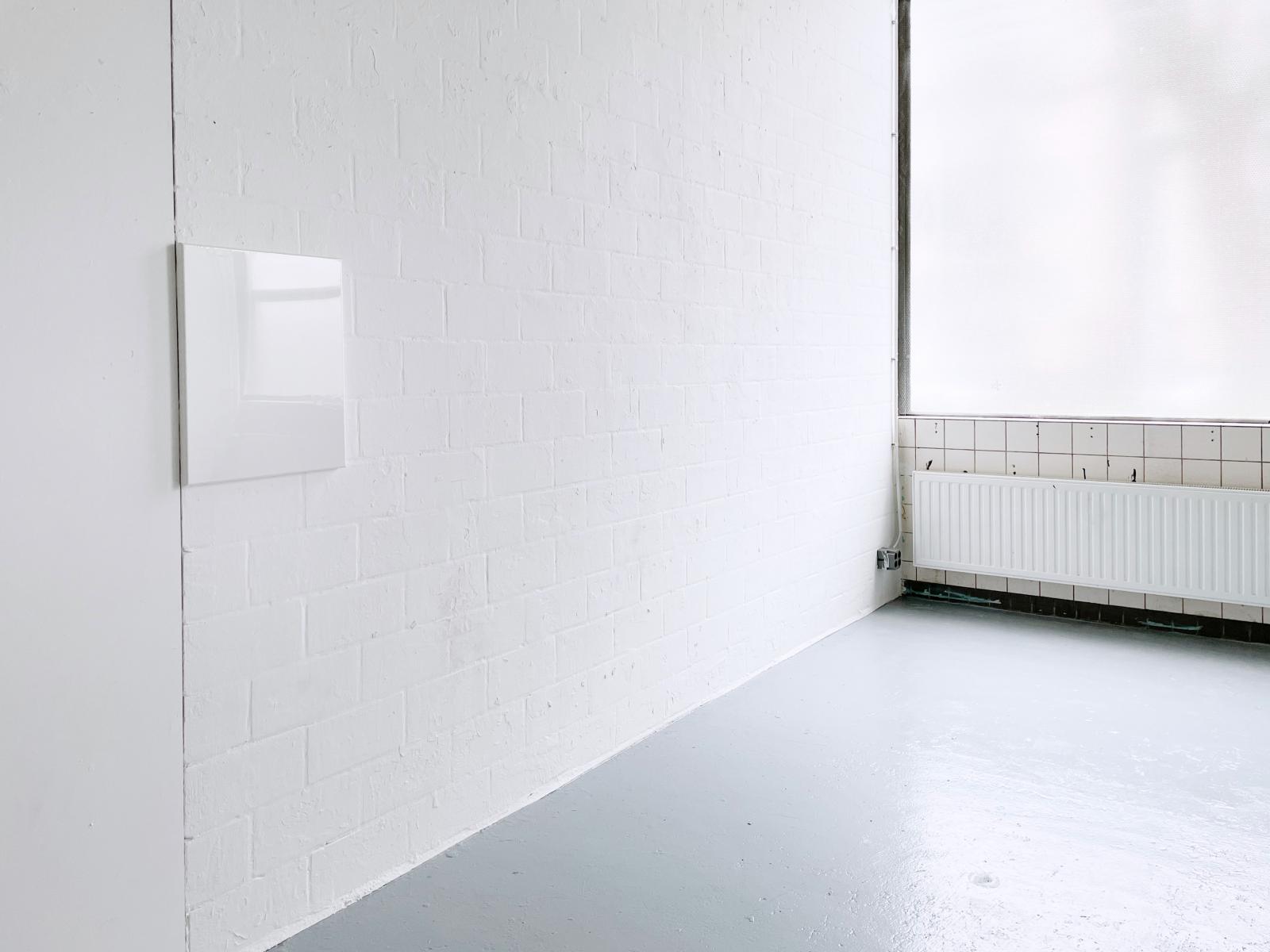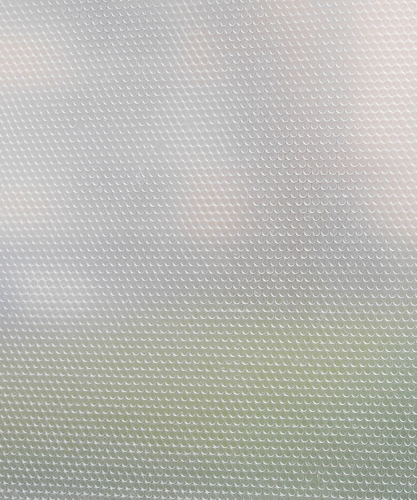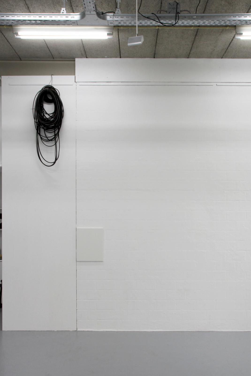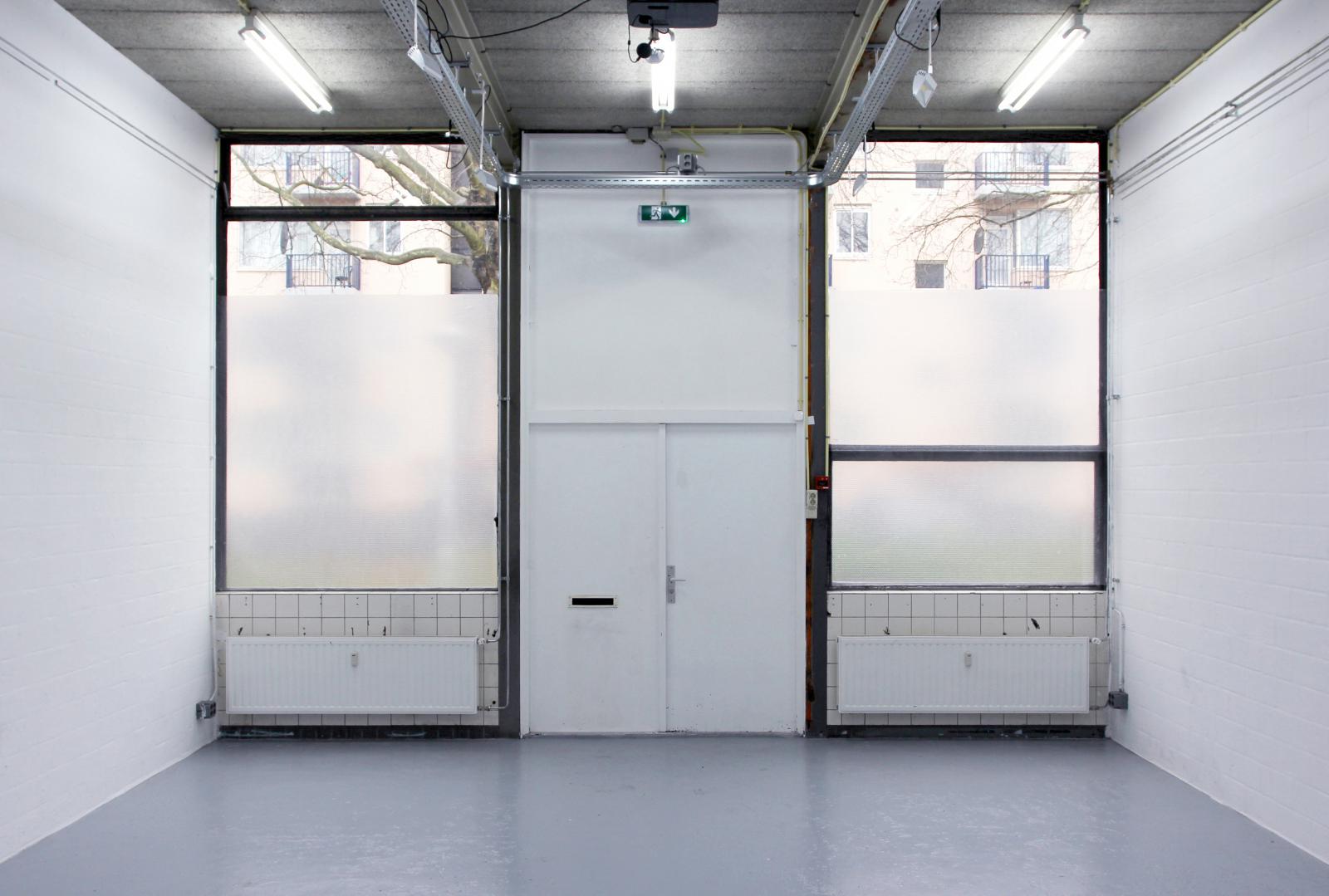
The exhibition VLAK presents a joint intervention of Erris Huigens and Clary Stolte at the artist run gallery De Bouwput. This intervention/installation will consist of experimental placements of surfaces and shapes in (reaction to) the project space. This creates a visual dialogue between material (both new and reused), surface, form, light and the architecture. The aim is to do this through very minimal interventions. During the installation days, some surfaces will be “replaced”, and the constantly changing light will affect the installation. This process will be photographed for a future publication in collaboration with designer Tijl Schneider. The final outcome will be shown on Sunday 10 April between 4:00 PM and 6:00 PM.
Erris Huigens presents his practice under the name Deconstructie. During his trips to abandoned buildings or factory sites, he paints murals. He also takes elements or paintings from his studio and places them on location; vice versa, he takes materials and objects left behind from the site back to the exhibition space. A shadow on the canvas becomes a subject and a blueprint for other paintings. A left behind object becomes the subject within the framework of a presentation. It is used like a tag in graffiti and possibly poses a direct connection to the artist’s roots in subculture. He places and relocates.
The works of Clary Stolte can be best described as ‘object research painting’. Which means a precise research of material properties and behaviour. This leads to minimal (sometimes humoristic), but often extreme interventions. She has stopped using paint, almost entirely, a long time ago. Why use paint when a piece of plastic reflects the light in the room so much better? Since then, her palette consists of diverse materials we know from our daily use: plastic, glue, nicotine, hair gel, shampoo, staples or adhesive tape. Her work is concerned with the symbolic rendering of primary transient elements: light, shadow, volume. Stolte’s works optimistically glitter and reflect. Most of all she wants to communicate the fun and play involved in making her work.
Tijl Schneider is a dedicated Dutch designer in London with a deep appreciation typography. His attention to detail is scary (in a good way). As a son of a contemporary furniture designer, he grew up with a love of clean lines. His design knowledge is second to none and everything that comes off his screen tends to be a beautiful thing.
